© All artworks copyright by Joern Frank Gebert
skip to main |
skip to sidebar

this is me:

- Jörn
- Graphicdesigner,
illustrator & artist
Living in Germany.
For commissions just write an email: joern@joerngebert.de
follow me
port of registry
walk of fame - caricaturists
great inspiring artists
blogging communities
pois
copyright ©
All artwork and text on this blog copy-
right © Joern Gebert, unless otherwise attributed to the respective copyright owner - it is illegal to publish, print or copy any such artwork or text without written permission by the artist. If you want to use a picture for any purpose, contact the artist for permission.
I'm sure you knew that already ...


6 comments:
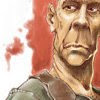
Looks great to me!
Great work Jörn!! I really love the color and illumination. By the way, I loved your website too. Congratulations buddy!!!
Amazing Jörn!! i love the lighting!!
cheers!
Lovely image and great blog. Your ink sketches are especially impressive.
Ciao,
Joe y Elio
I have seen you usually use red colors and then you changed then into blue colors.. is there any reason to do it??.. I agree with Jeremy.. it looks great to me..
@ all: Thanks for your kind comments, i will reciprocate.
@ricardo: You like? I'm not really contendet with my site, so there will be a few adjustments soon. But thanks for commendation.
@ bógar: The reason for the coloring is easy: as i wrote, it wasn't my best sketch, so i tried to make the most of it. This classical cold/warm-contrast is always a great stylistic device to make pictures look better. And i like it;)
Post a Comment